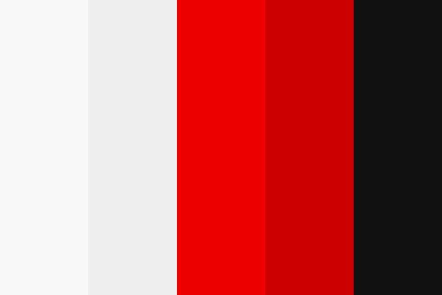
Image- ColorHex Throughout this whole process, I had do much trouble sticking to a color scheme. I know it may not seem like a big deal but to me it effected my work ethic so much. Originally I wanted to do black, red, and white because I wanted to give off the impression of power and neutrality. However, I realized this was severe mistake, these colors are overpower. The black creates and empty and voided look. The color white contrasts too harshly against the other two colors and is distracting. Red is really bold and should be used rarely. Combined these colors are heavy and fight against one another
The best decision I made was incorporating more mid-tones like pink, This color helped soften my magazine and bring life to my images. You see, my original image was black and white. This gave my subject a washed out look and made my picture look lifeless. The pink brought in more vibrancy to my product and allowed me to experiment with more colors. After this creative decision, I used red and black sparsely. I used more pink and white because it made my letters legible and the paired well together. The only reason I used pink because I wanted to change my target demographic to females. Simply because, more women tend to read magazines than males.
0 Comments
Leave a Reply. |
AuthorA highschool student in her senior year. Archives
April 2021
Categories |

 RSS Feed
