|
Every good magazine needs a good table of contents. The primary purpose of a table of contents is to give a brief overview of the magazine articles and topics. For my magazine, I'm looking for a more simplistic design with minimal colors.
Another example I'm thinking of drawing inspiration from is the table of contents below... 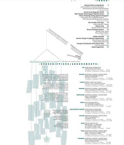 I like the overall flow of the magazine and the large amounts of negative space, it's very soothing to the eyes and contradicts the cluttered nature of the fonts and typography. I like the incorporation of the small graphic because it gives some visual interest to the otherwise bland white background. I like how small the font is but not the color scheme. This table of contents doesn't fit into my black and white scheme because the blue is calming and I'm trying to create an illusion of power by using red. Overall this example is unique and simplistic but it doesn't fit the robust atmosphere I'm trying to emulate. The typography seems shy and i would need to use more bold and heavy letters to make it seem dramatic. From, this example I learned that the size of fonts really matter and that I may like something but I need to stick to a my original theme. I'm going to mimic the shaping and arrangement of the lettering. Photo- Unknown So far, from the examples I like I can conclude that I gravitate towards arrangement and form...
Ideas for Topics Titles?I want to stick to runway terminology and less sensational like language (like defamatory titles). I want my magazine to only discuss fashion and not delve into lifestyle topics like politics or celebrity gossip.
Some ideas for topics I have are... 1. LATEST FASHION TRENDS OF THE YEAR 2. WINTER/ FALL FITS TO WEAR THIS YEAR 3. SUMMER/SPRING FITS OF THE YEAR 3. TOP FASHION MODELS OF THE YEAR 4. EXCLUSIVE INTERVIEWS WITH LATINX MODELS 5. EXPLORING COLOR THEORY IN WOMEN'S WEAR 6. GENDER NORMS AND CLOTHING 7. FASHION AND PREJUDICE 8. WHERE DOES YOUR FASHION COME FROM 9. SUSTAINABLE FASHION VS FAST FASHION 10. DESIGNERS AND CREATIVITY I want to use capital/bold letters so people can see my topics from a distance
0 Comments
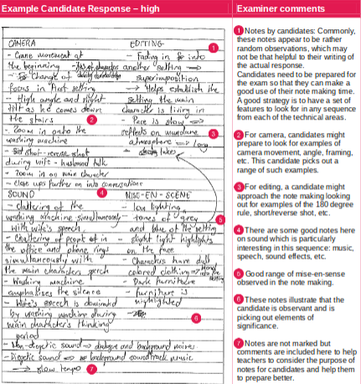
Notes PortionWhen studying for an exam it's important to take initiative and seek candidate examples. Below is a sample of a students notes, next to it is my take on the infamous Fargo clip. I will be analyzing the difference and similarities between both responses. As well as exploring how I can improve.
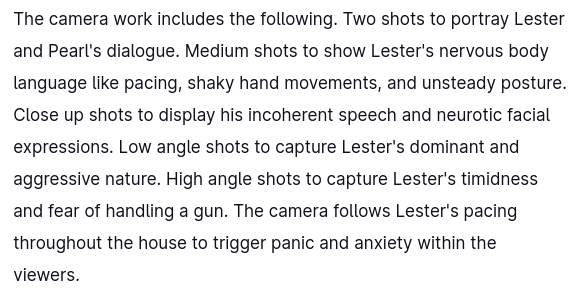
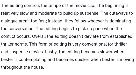
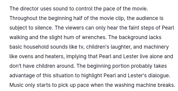
Camera Work ResponsesThe sample response is very detailed and uses lots of vocabulary. They focus on camera angle terminology like crane, high angle shot, and tilt to describe the camera's motions. This differs greatly from my notes because I choose to focus on the speed and emphasis of the camera's placement. The writer gave specific examples and scenes where the angles varied greatly. But I just briefly touched over and highlighted camera movements that were the most frequently used and not smaller instances where the camera angles differed greatly. However, we both discussed how Fargo's camera crew used lots of zoom-ins and close ups to show the expressions of the characters. We both analyzed how the camera emphasized conversations. In the response's case they discussed medium shots, while I mentioned the impact of zoom-ins. From this response alone I can infer that I need to incorporate more terminology into my descriptions and provide more specific examples of variation between camera angles. Editing Responses Both of our editing notes are very similar and don't differ as much as our camera work responses. We both analyzed how the pacing of the movie clip is established by lulls and pauses in camera speed, and we both mentioned how slow the transitions/ cutaways were. In general, we both wrote about the slow and deliberate pacing of the camera crew. The main difference between our notes was the candidate's analysis of the movie's long takes. The candidate focuses on how the long takes establish the importance of a setting. From my notes, I can tell that I didn't noticed the long takes or choose to not discuss them. The candidate was more analytical and methodical from what I noticed. From this sample note I can tell I need to focus more on the importance of a movies backdrop and its overall role in the progression and pacing of a plot.
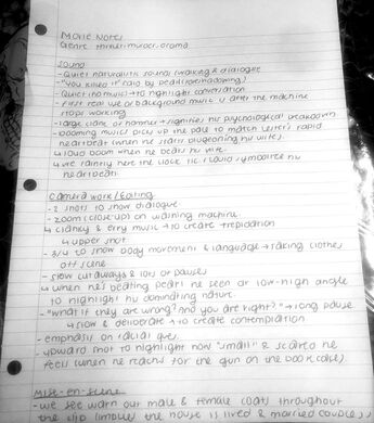
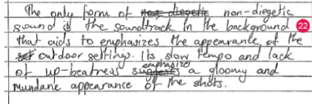
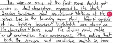
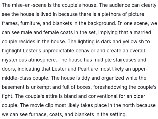
Sound/ Music Responses The candidate uses words like non-diegetic and diegetic to describe Fargo's sound. They focused more on the dialogue/ speech of the characters and the accompanying background noise (ie. Pearl speaking over the washing machine). They detailed more on the background noises than the actual soundtrack. My notes were the opposite I went into some detail about the music's composition and booming sounds and the overall effect they had on the audience. From these responses, I can infer that my notes are more emotional based than the candidates. Some similarities, our notes share are we both placed an emphasis on the washing machine's noises and the use of silence to convey contemplation Mise-en-scene ResponsesThe candidate mise-en-scene notes are less detailed than mine. My notes give specific examples that imply the house is lived in. I included examples of coats, picture frames, and blankets to show a married couple resides in the house. I went into depth over the importance of the basement's arrangement and how it differs greatly from the home's tidy nature. I also speculated where the home is located based on the movies mise-en-scene (ie. the furnace, blankets, and coats). The main difference was the candidate detailed the characters clothes and the colors of the furniture, while I didn't. The most prevalent similarity is we both noticed the lighting the house is set in. We both pointed out how dark and dim the house was. This section has made me realize that I need to incorporate more color theory in my responses. And the overall effect the hues/ saturation colors have on the mood of the story. Final Take-aways of Notes?From this response alone I can see that I need to use more vocabulary and terminology to describe what is happening in a scene. My responses are more about the emotional impact the creator is trying to convey and not the overall purpose of how these elements are moving the plot forward. I need to look for more niche examples of camera editing and not just the most commonly used ones. Finally I can incorporate more examples of how background noise intermingles with dialogue. In simplest terms, I need to be more specific and use more terminology. Analysis of Responses:Specific Similarities/ DifferencesI will highlight specific examples and instances where both the candidate and I differed greatly and share. 1. Camera Work
Both of our responses mention the use of multiple camera angles and their purpose. We both discuss closeups and their intended purpose. However, the former's response is more detailed and in depth. We both differ in that the candidate incorporates the layout of the scenes and the music to show how they aid in create subtle yet noticeable changes in Fargo's atmosphere. Their camera work response includes much more camera terminology. And from what I've read so far from their complete response they have a better understanding of how the camera is never set on a single position but multiple. 2. Editing
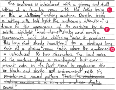
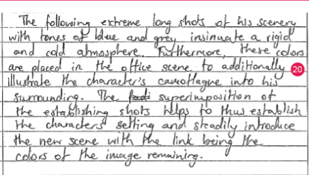
The candidate mentions lots of establishing shots to highlight the tempo and mundane nature of Fargo. They describe the settings layout to show the relationship between camera angles and monotonous background. However, my portion focuses less on the editing and speed of the camera and more on noise/ sound. My response is more speculative about the overall nature of the mise-en-scenes elements and what they can imply, while the candidate takes a more methodical approach. They analyzed all elements of movie composition, while I only focused on music and background for my editing response. The main similarity between our responses is we both noticed the lack of speed and use of long takes to create an aura of suspense. 3. Sound
The candidate's response is more about background music than soundtrack music. They place a bigger emphasis on non-diegetic sounds like outdoor ambience. From the full response I noticed they went into depth over background music and silence. They explained that it slowed down the movie and highlight the facial reactions and body movements of Lester and Pearl interaction. They placed a major emphasis on the washing machines impact and its role in showing Lester's contemplation. In general, we both noticed dialogue breaks and the importance of booms in facilitating the acts of Fargo. 4. Mise-en-scene
A difference we both have is the candidate discusses at length the nature of the furniture, while I didn't. Their full responses analyzing how the colors of the furniture is muted and dark and the symbolic implication it has. I; however, did not do this and instead I discussed the colors of the lighting and the overall mood is sets. One similarity is both our responses touched on lighting and the wardrobe choices of the characters and what they could imply.
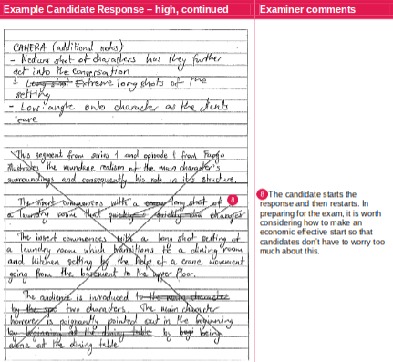
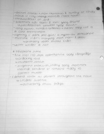
From this analysis I can tell that I need to work more on explaining things in detail and learn to integrate more elements and how they are introduced. I need to focus on these examples and give a 4 element analysis on why they were written this way. This exercise has taught me to be more observant and less speculative. Images on the left side- AICE Cambridge Media Studies Images on right- my images 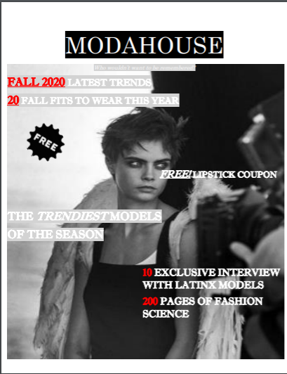 Photo take by- Douglas Cosmetics The magazine features a picture of Cara Delevinge with a pair of angel wings. The image is in black and white to create a somber mood. Coupled with Delevinge's serious stare we get an atmosphere of power and elegance. Her clothes are minimal and simplistic to highlight her defined face and willowish body. It's framed in a 3/4 shot, so the upper part of her body is shown and the remainder is hidden and out of view. Its captured in low light and the contrast is high. It's shot at a level angle that doesnt distort her body or face.
The magazine captures are attention because the color scheme is very bold and monochromatic. This makes the magazine look different and unique from other tabloid magazines that feature bright colors and neons. The featured pose is very relaxed and comfortable, this captures the audience's attention because it creates an aura of mystery and begs the question of what's on her mind. The masthead is ModaHouse. Moda means fashion in Spanish and house is a reference to fashion houses in Europe. Combined these two elements give a hint to their demographic; North American. South American, and European countries. This can be inferred because the name of the magazine is in Spanish and English (two of the most common languages). The typography is bold and consists of capitalized letters. The letters are eyecatching because capital letters are more recognizable than lower case letters. The overall color scheme of white and red is very minimal and shifts attention to the pictures. The letter size is small compared to the picture. The arrangement of the letters follows the shape of her body, so the model remains the main focus. The strapline is the title ModaHouse. The letters are white and the background is black to create a classic and chic look. The font suggests that it's meant for a fashion and aesthetic conscious audiences. It suggests the pictures are the main focus because the fonts are minimal. One rhetorical question used is "Who wouldn't want to be remembered?" This captures the audience's attention and convinces them to pick up an issue because it makes them believe the magazine will help them achieve this. The straplines are in the present tense and include words/phrases like exclusive and fashion science to make audiences believe the magazine and its contents are high-end. The most prominent linguistic element is the lack of exclamation marks and capitalized letters. This makes the phraseology look appealing without trying too hard |
AuthorA highschool student in her senior year. Archives
April 2021
Categories |
 RSS Feed
