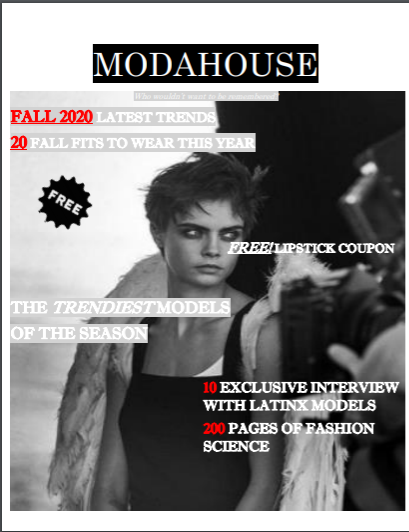
 Photo take by- Douglas Cosmetics The magazine features a picture of Cara Delevinge with a pair of angel wings. The image is in black and white to create a somber mood. Coupled with Delevinge's serious stare we get an atmosphere of power and elegance. Her clothes are minimal and simplistic to highlight her defined face and willowish body. It's framed in a 3/4 shot, so the upper part of her body is shown and the remainder is hidden and out of view. Its captured in low light and the contrast is high. It's shot at a level angle that doesnt distort her body or face.
The magazine captures are attention because the color scheme is very bold and monochromatic. This makes the magazine look different and unique from other tabloid magazines that feature bright colors and neons. The featured pose is very relaxed and comfortable, this captures the audience's attention because it creates an aura of mystery and begs the question of what's on her mind. The masthead is ModaHouse. Moda means fashion in Spanish and house is a reference to fashion houses in Europe. Combined these two elements give a hint to their demographic; North American. South American, and European countries. This can be inferred because the name of the magazine is in Spanish and English (two of the most common languages). The typography is bold and consists of capitalized letters. The letters are eyecatching because capital letters are more recognizable than lower case letters. The overall color scheme of white and red is very minimal and shifts attention to the pictures. The letter size is small compared to the picture. The arrangement of the letters follows the shape of her body, so the model remains the main focus. The strapline is the title ModaHouse. The letters are white and the background is black to create a classic and chic look. The font suggests that it's meant for a fashion and aesthetic conscious audiences. It suggests the pictures are the main focus because the fonts are minimal. One rhetorical question used is "Who wouldn't want to be remembered?" This captures the audience's attention and convinces them to pick up an issue because it makes them believe the magazine will help them achieve this. The straplines are in the present tense and include words/phrases like exclusive and fashion science to make audiences believe the magazine and its contents are high-end. The most prominent linguistic element is the lack of exclamation marks and capitalized letters. This makes the phraseology look appealing without trying too hard
0 Comments
Leave a Reply. |
AuthorA highschool student in her senior year. Archives
April 2021
Categories |
 RSS Feed
