|
In my last post I explored table of contents inspiration. Today I'm going to see what I can improve on and answer the following concerns/ questions:
From these I hope to gain a better grasp of what I'm trying to achieve...
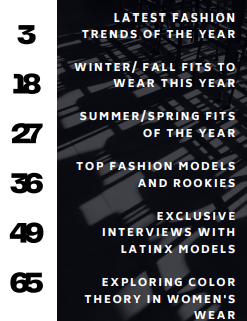
Image- I made it My product somewhat challenges conventions because I'm using large/bold numbers to display my page numbers, in other fashion magazines the numbers are relatively small. My table of contents is very bold and somewhat cluttered. Typically fashion magazines are simplistic and modern, they use thin and delicate letters. It represents social groups because the images (a women walking in a dress and a myriad of chairs) show daily depictions of life. The woman can be a maternal figure and the chairs can represent either work or education. The large letters and number accommodate sight- impaired individuals and helps them see the titles from a distance or from arms length. The bold contrast (black and white) helps increase the readability and helps people understand the text much better.
The product engages with audiences because the the overall sizing and color scheme makes it easier for people to see it from a longer distance. For example, if the audience were In a grocery stores they would most likely pick the issue up because the characters are easy to decipher and eye-catching. The images are faint enough to not interfere with lettering, so people will be pleasantly surprised that their are graphics in the magazine. The media will most likely be distributed in a book store because based on the titles its more informational than sensational. Some things I can improve on include the following - The placement of the logo - The sizing of the numbers and white space - The overall theme because the table of contents
0 Comments
|
AuthorA highschool student in her senior year. Archives
April 2021
Categories |

 RSS Feed
