|
New: Table Of Contents
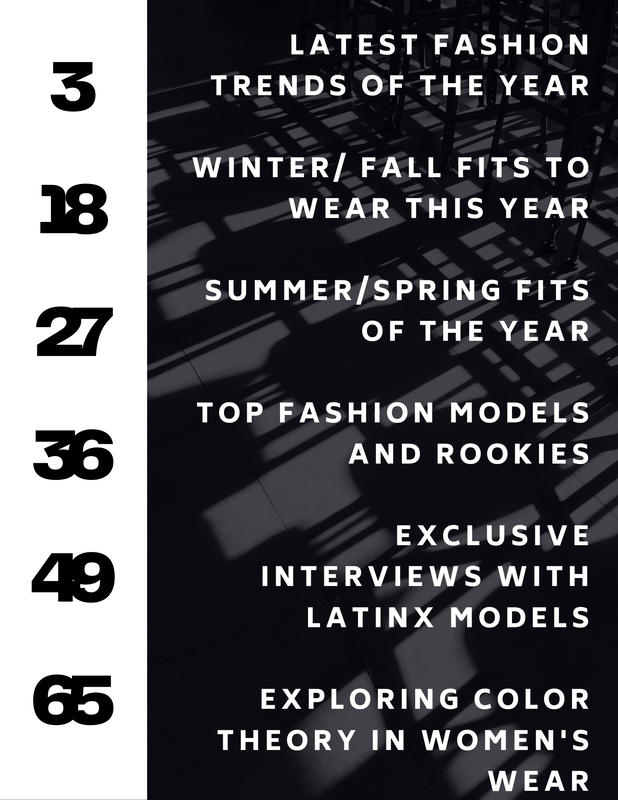
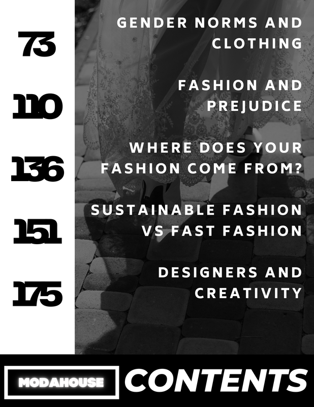
Original: Table Of Contents
Images- made by me, Background- Creative Commons Overall for this revision, I wanted to test out a more simpler layout. The main changes I did was include more color and the arrangement of the text. My new copy has no pictures and includes the color pink. After comparing these two drafts, I realized that I should leave the pictures in the final copy because it makes the pages look more interesting. I deleted the "ModaHouse Contents" text because I thought the placement was odd. In the new draft, I made the text left aligned. My main goal was to simplify the overall design, because I thought it looked to cluttered. But, after seeing the pictures side by side, I think I should leave the cluttered look because it looks more appealing. My main goal for my final copy is to make it more feminine and aesthetically pleasing. I want to include more pinks than reds because the red looks very domineering and pink seems more inviting.
0 Comments
Leave a Reply. |
AuthorA highschool student in her senior year. Archives
April 2021
Categories |
 RSS Feed
