|
While creating my pages I encountered many problems. One of the issues was portability. I used to use my Chrome book to create my layouts; however, midway through my magazine cover mock up I upgraded to an HP pavillion. I did this because my chrome book had a very small screen size and I wanted to adapt to online school. For some time, I really liked this switch. But, I quickly encountered some issues like portability and in-depth changes. You see I couldn’t work on my pages when I had inspiration I had to go out of my way to work when I didn’t feel inspired. So, over a few months I saved up for an IPad because I wanted to work on digital art more and have access to my work whenever I pleased. This worked out the best for me because whenever I was inspired in the car or at friends house I would do my pages. Towards the end of revision process, I exclusively used my iPad because it was compatible with Canva.
0 Comments
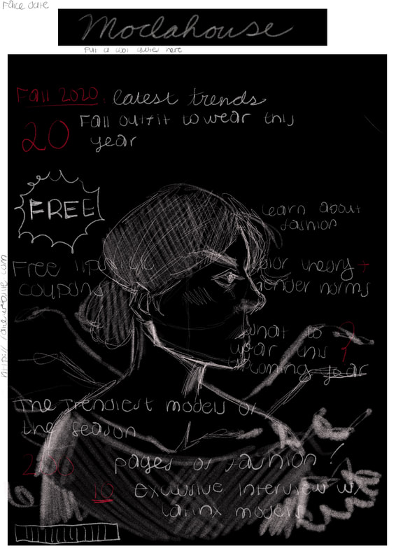
While looking through my folders yesterday. I discovered the original drawing I made of my magazine cover and the little notes I attached. I made this drawing on Medibang paint. I thought it would be interesting to include this drawing because it looks very different from my finalized piece. Below is the drawing and next to it is my cover...
Image- Drawn by me I'm thankful that I deviated from this plan because my softer palette and bright image is more eye catching than my original idea.
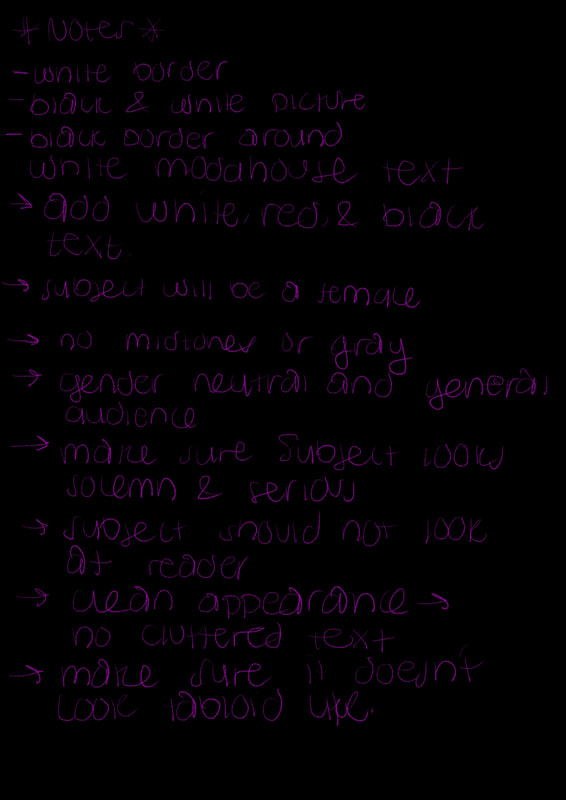
As of right now, I'm drafting up my critical reflection. I've been writing this for a while now. I've written small portions of questions 3 and 4. Below is a draft of question 3...  Image- created by me This portion was written around February 1st. As of right now, some parts of this write up don't reflect my magazine anymore. I no longer use as much black as I used to. My magazine is no longer serious;, it is more feminine and simplistic. The colors are no longer gender neutral and my letters don't contrast harshly anymore. I think I'm going to have to scrap this portion in my final writeup. I'm still going to keep the switch to Canva portion and I'm going to talk about my struggles more. Im going to talk about burnout, switching ideas, and the cleanup process.  Image- created by me This was written around Feb 12th. I'm going to rewrite this reflection because I feel like it doesn't make sense. I'm going to break up the paragraph into multiple ones because I want to seperate each magazine page into its own section. I'm going to expand on the software I used. I'm going to talk about Procreate a bit because towards the end of my process I stopped using my computer and I ended up using my Ipad for my final touches. In general, I'm going to update the information so, it is more applicable to today.
Below is a simple slideshow of some of the images that inspired my table of contents... Images- Taken from Pinterest I got most of my inspiration on Pinterest. I did this because I used to use the app for art reference. I saw a lot of mood boards and fashion magazine layouts. These layouts inspired me to mimic the styles presented. I also looked at agenda pages because they were very simplistic and blank. I color dropped the images for my text and I kept doing these for all my pages. Overall, the app was very helpful for me to see how layouts are formed. It helped me understand visuals and color palettes.
For my first draft I used Microsoft Word. Unfortunately, I didn't understand how to use it. I tried wrapping the text around Cara Delevingne (my place holder image) but it didn't work. I also tried adding a sticker and barcode. However, I placed the sticker in awkward angle and I couldn't put the barcode on the text document. As you can see, I had a lot of issues using the program. So, I decided to switch over to InDesign. 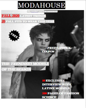 Image- Douglas Cosmetics When I switched over to InDesign, I immediately had the same issues. I didn't understand the elements tab. I couldn't even put a text box into the canvas. I though I was doomed until I heard my teacher mention Canva. 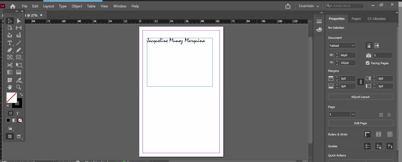 Images- made by me I knew Canva was the right program for me when I saw the program's layout. I liked how everything was divided into categories and how easy it was to manipulate the text. I liked how I can lasso all my text boxes into one and move them in the same direction together. I ended up using Canva for all of my revisions and drafting process. I ended up liking Canva so much that I even use it for artwork.
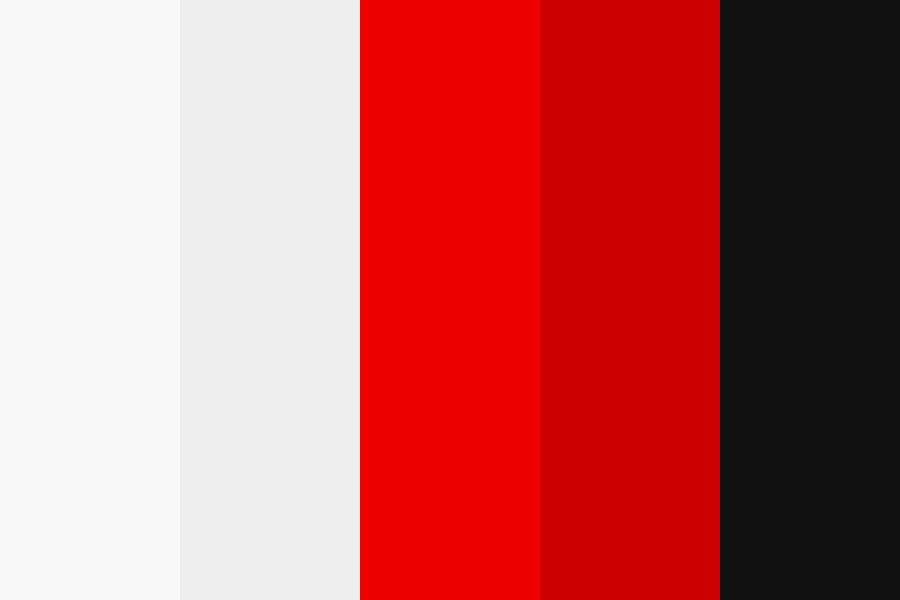
Image- ColorHex Throughout this whole process, I had do much trouble sticking to a color scheme. I know it may not seem like a big deal but to me it effected my work ethic so much. Originally I wanted to do black, red, and white because I wanted to give off the impression of power and neutrality. However, I realized this was severe mistake, these colors are overpower. The black creates and empty and voided look. The color white contrasts too harshly against the other two colors and is distracting. Red is really bold and should be used rarely. Combined these colors are heavy and fight against one another
The best decision I made was incorporating more mid-tones like pink, This color helped soften my magazine and bring life to my images. You see, my original image was black and white. This gave my subject a washed out look and made my picture look lifeless. The pink brought in more vibrancy to my product and allowed me to experiment with more colors. After this creative decision, I used red and black sparsely. I used more pink and white because it made my letters legible and the paired well together. The only reason I used pink because I wanted to change my target demographic to females. Simply because, more women tend to read magazines than males.
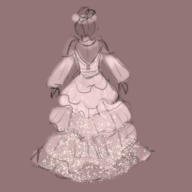
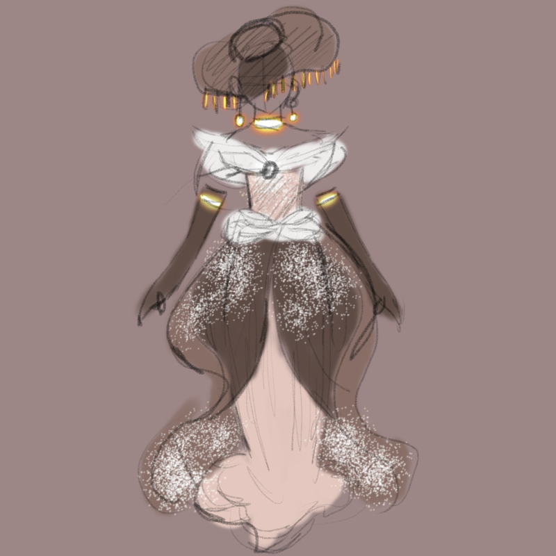
Images- Drawn by me I picked a fashion magazine because I like looking at fashion shows like America's Next Top Model and Project Runway. I like following along on fashion trends and going through my social media to see the most popular makeup and clothing styles. I just like how things pair together and the satisfaction of seeing odd items come together to create a look. Since I am an artist, I like drawing out ball gown dresses and creating my own designs. I usually do this for fun; so, I saw this as a chance to incorporate my own personal flair into my work.
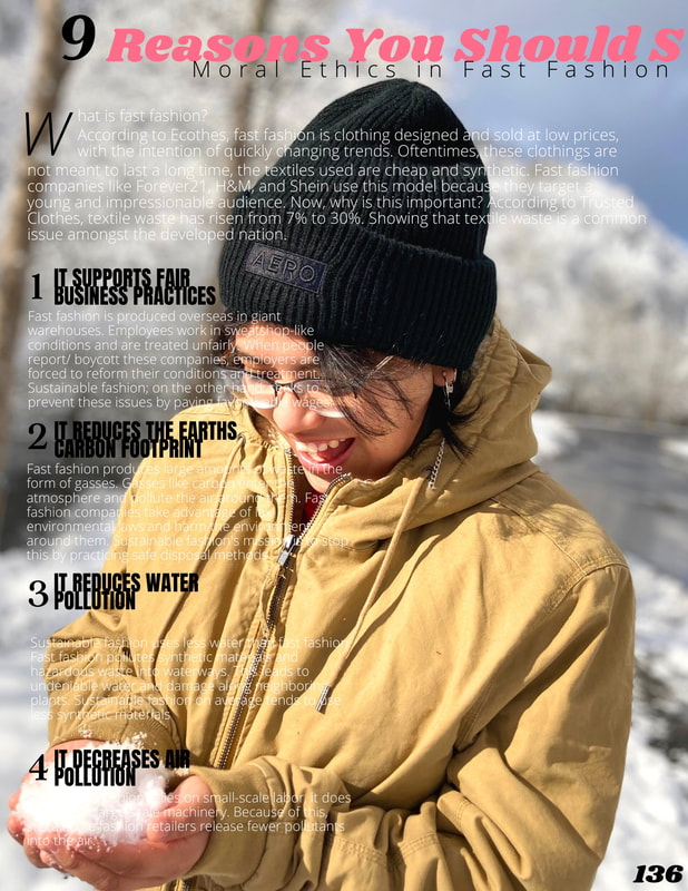
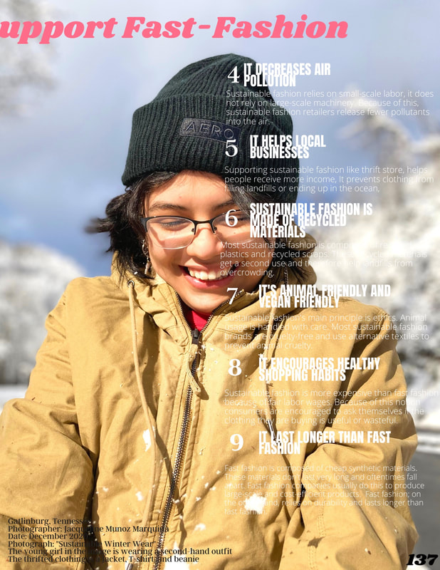
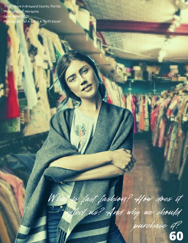
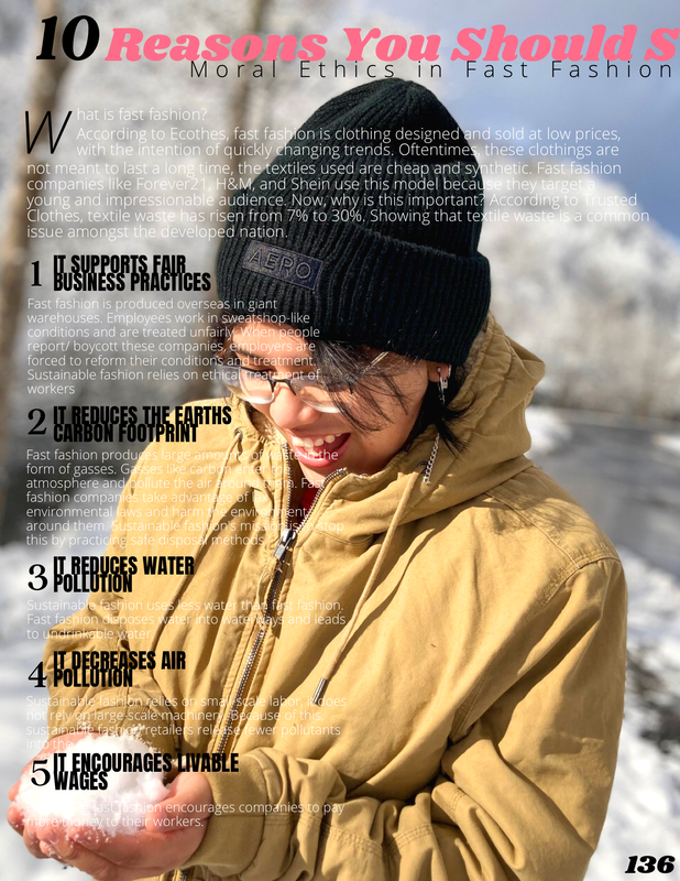
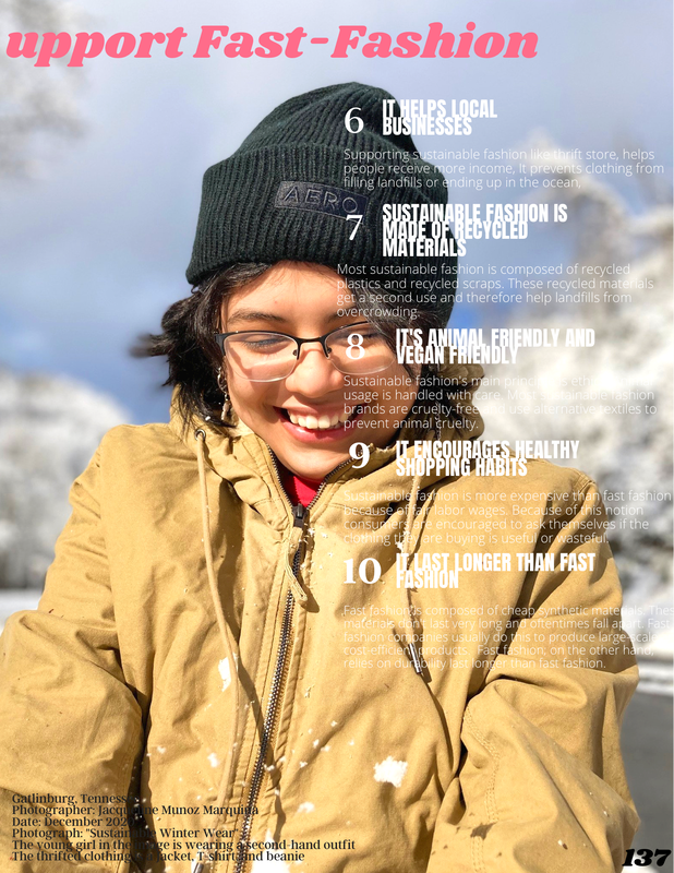
I took my pictures in Gatlinburg, Tennessee. I took the images along the road. My sister and I were on vacation and we decided to have a spur of the moment photoshoot. My father was driving and we spotted a smell stream carrying snow. I begged him to stop the car because the clearing was making the water sparkle. I took this picture early in the morning because I though the lighting was amazing. I ended up using the images because my sister was wearing a thrifted outfit. Were both from Florida so, we don't own any winter clothing. That's why I used the images, it matched my sustainability article.
Today I will be discussing my Two page process. Below is my final revision...
Images- Taken by me 1. This is my first draft. I just wanted to get my overall idea down. I wasn't really concerned with the look. Originally I wanted to add more green into my article because it was about sustainability but, I later changed this because I thought it wouldn't match my other pages.
2. For my second draft, I thought the pages were to bland and I didn't like the background color, it looked to harsh next to neon green. So, I decided to use a more muted green because I thought it was easier on the eyes. But, I later changed this because it made the text to hard to read. 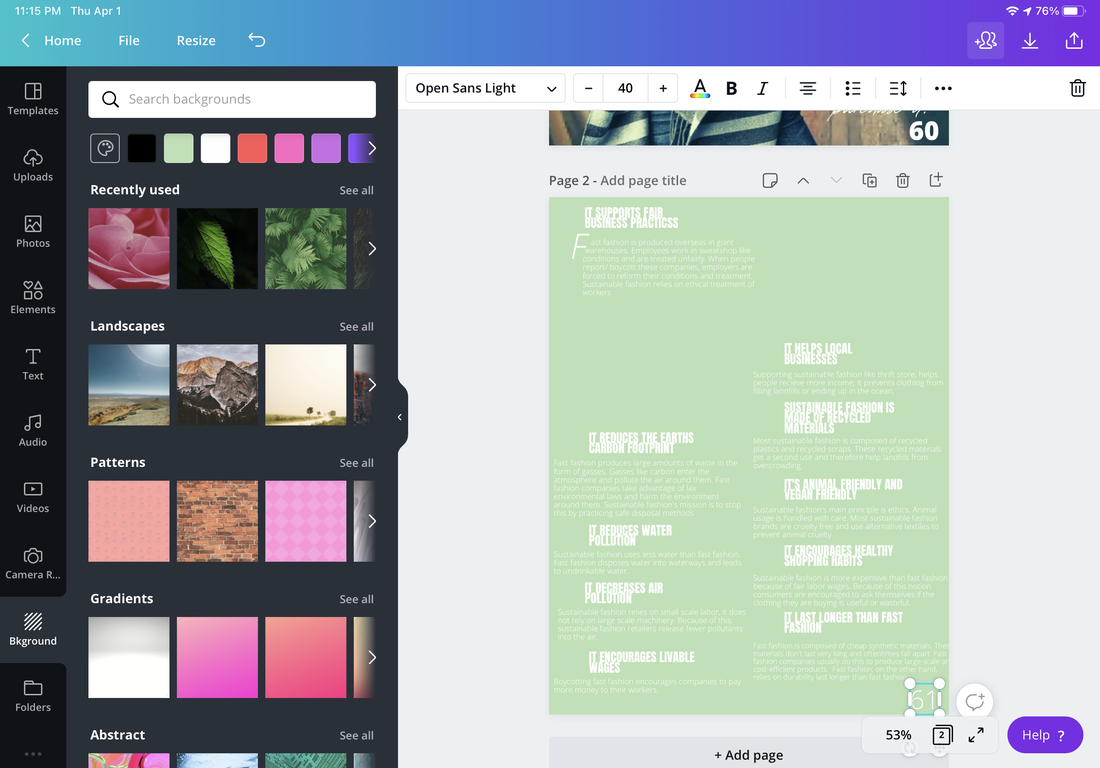 Image- Created by me 3. For my third draft I switched the green to pink. I didn't like this stage either because I thought it looked washed out. I added black text to experiment with the color scheme and I ended keeping a portion of this idea later. I wanted to play with the title a bit and I did this by stretching it across two pages. 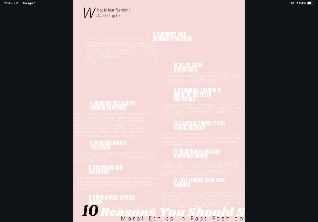 Image- Created by me 4. This was by far my most developed phase. I had a clear idea of what I wanted to do. Originally I was going to do a photoshoot in the thrift store but, I ended up scrapping this idea when I remembered my trip to Gatlinburg, Tennessee. In the picture, my sister was wearing a thrifted jacket and shirt from Goodwill. I remember taking this picture and liking how it came out. So, I decided to use it because I liked the lighting and poses of her in the snow. I mostly incorporated it because of the location. The main changes are; the background, font arrangement, and title. I decided to use full images as my background because I thought it would pair nicely with the theme of my article. I moved the word around because I thought my first draft looked overcrowded. I moved the title up because the placement was odd. I also added the page number and I added a small paragraph to describe what is happening in the picture because I wanted to add context to the image.
Image- taken by me
1. Draft #1- My original draft was very different than my final revision. Like I said earlier, my color scheme was black, white, and red. At the time, I was going for a gender neutral and bold look. I had harsher fonts and my image was in black and white. My original idea was to have a girl wearing a set wings but, I later decided to change this to a simple dress which can be seen in my second draft. As you can see, I didn't understand how to use fonts or stickers in my piece. I wanted add more smaller texts and wrapping. 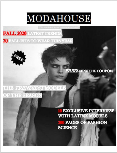 Image- Created by me, Model Picture- Douglas Cosmetics 2. Draft #2- After a few months of weighing in different ideas like adding more cursive fonts and adding more color, I suddenly had a burse of inspiration. You see, I was scrolling through Pinterest and I noticed a picture of Japanese magazine. In this picture. I saw lots of girly fonts and aesthetically pleasing dresses. That's when I decided that I needed to add more of feminine flair. I added more bubbly fonts and neon pinks. I changed the black and white picture to a more muted colorful one. I took off the white border because I thought it was unnecessary. I changed the ModaHouse logo because I thought it didn't look eye-catching. So, I removed the black square and replaced it with a softer font. I really liked this change the most. The biggest change by far was the platform I was using, I used word for my first draft, But, after hearing about Canva, I decided to give it a try. This was by far, my best choice.** 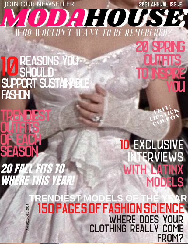 Dress Place holder Image- Pinterest 3. Draft #3- My final revision was my most favorite editing and idea making process. I add more symbols and shapes to fill in the empty space from before. I mostly kept the same look, the main difference is my cover photo. I decided to use a close because I saw it on a few Vanity Fair magazines. I liked the aesthetic so, I decided to photograph my subject in a similar fashion. I took a photo of her in dark room near a window because I wanted to recreate a baroque lighting setting. I really liked this image because of the dramatic lighting. The only thing I would have changed is my lack of documenting. I wish I took more picture of my process. I should have kept my notes and inspo. But, I didn't because most of ideas were from a spur of the moment inspiration 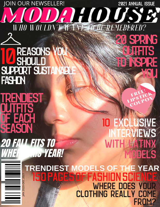 Image- Taken by me
|
AuthorA highschool student in her senior year. Archives
April 2021
Categories |


 RSS Feed
